A few months ago we decided to shred the Servicejoy website (which was up since 2012) and redesign it from scratch. We liked the current website (i’m sure not everyone were fan of the old design) yet we wanted to see if we could do better, to better communicate at a glance. Specifically we were interested in more visuals, less text.
We started with very low-fi sketches of the big idea behind the design. Those had no details, nor words. Just rough ideas.
We played with the feature-icons, words, subheads, and other content. We then tweaked few small things to make the website informative, easy to navigate, and pleasant to look at! We then decided to add icons representing the major features/benefits of Servicejoy.
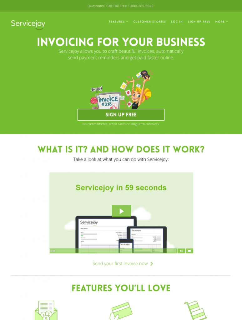
After a few rounds of tweaks, we ended up with this:

Since the launch of the new website we were thrilled with the performance.
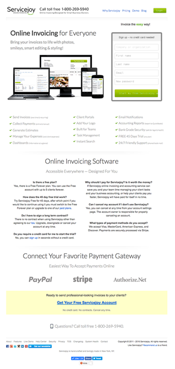
Old vs. new
For reference, here was the old design:

And here’s the new design:

Over the next couple of weeks we’ll be applying some additional tweaks to the new design. There are a few things missing that we’d like to incorporate, and a few things we’d like to move around, but so far so good.


